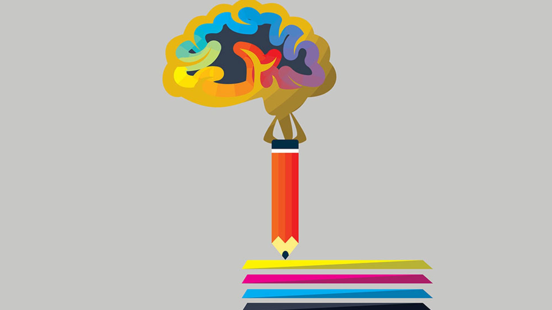
Understanding the psychology behind colours is crucial in logo design. Colours evoke emotions and perceptions, making them powerful tools for branding and marketing. Let’s delve into the basics of colour psychology and how it influences logo design.

Importance of Color Psychology in Logo Design
Colour psychology is all about how colours affect human behaviour and emotions. When it comes to logos, the colours chosen can have a big impact on how people perceive a brand and whether they’re drawn to it. For example, warm colours like red and orange can make people feel excited or energetic, while cooler colours like blue and green might evoke feelings of calmness or trust. By understanding these associations, designers can choose colours that send the right message and create a logo that connects with the brand’s audience.
Imagine you’re designing a logo for a new clothing brand. If the brand wants to convey a sense of energy and excitement, you might choose vibrant colours like red or yellow. But if the brand is all about sustainability and eco-friendliness, you might opt for earthy tones like green or brown. Each colour sends a different message, so it’s important to choose ones that align with the brand’s values and target audience. This way, the logo can instantly communicate what the brand is all about and appeal to the right people.
The Impact of Different Colors
Every colour has its special effect on how people feel and what they think. Take red, for example. It’s often linked with feelings of passion, energy, and excitement. That’s why it’s a good choice for brands that want to show they’re powerful or urgent. Then there’s blue, which tends to make people feel calm, reliable, and trustworthy. That’s why you often see it used by tech companies and banks. By understanding how different colours affect people’s emotions, designers can pick the right ones for a brand’s image and what it stands for.
Imagine you’re designing a logo for a new fitness brand. You might choose red to show that it’s all about energy and motivation. But if you’re creating a logo for a meditation app, you’d probably go for blue to give off a sense of calmness and peace. Each colour sends its message, so it’s important to choose ones that match what the brand is all about. That way, the logo can connect with people and make them feel the right way about the brand.
Choosing Colors for Your Logo
When selecting colours for a logo, consider the brand’s personality, target audience, and industry. Warm colours like red, orange, and yellow are dynamic and attention-grabbing, while cool tones such as blue and green evoke feelings of tranquillity and freshness. Combining complementary colours or using a monochromatic scheme can create visual harmony and balance in the logo design.
Cultural and Contextual Considerations
It’s essential to consider cultural associations and context when choosing colours for global brands. Colours can have different meanings across cultures, and what may symbolize positivity in one culture could signify negativity in another. Conducting thorough research and understanding cultural nuances ensures that the chosen colours resonate positively with diverse audiences worldwide.
Testing and Iteration
Colour psychology in logo design is not a one-size-fits-all approach. It’s essential to test different colour combinations and gather feedback from target audiences to determine the effectiveness of the logo. A/B testing and iterative design processes help refine the logo until it successfully communicates the desired message and elicits the intended emotional response.
Conclusion
Incorporating colour psychology principles into logo design enhances brand identity and strengthens consumer connections. By harnessing the psychological power of colours, designers can create logos that leave a lasting impression and drive brand recognition and loyalty.


